Yea, I'd be adding a few colours so I can get the full selection of colours needed for wools, clays and tinted glass. Apart from that I'm going to try and stick with the palette once the contest is over.
Gosh! These are so awesome! Your ores could benefit from some more pop. Lovely shapes, though. Your crafting table, door and woods are brilliant. And I am totally jealous of your neutral stone colors. Much easier to work with, I expect.
These are what I got, folks.
Note a few new blocks above: tilled soil, bookshelf, diamond block [shading added], stone brick. I slightly simplified the shadows under my diamond ore tile and changed the red brick and sand to fit stylistically.
Edit: Also added gold block, glass and crafting table; expanded bookshelf capacity.
Also: Call me Matt. No need to type out my username.
Gosh! These are so awesome! Your ores could benefit from some more pop. Lovely shapes, though. Your crafting table, door and woods are brilliant. And I am totally jealous of your neutral stone colors. Much easier to work with, I expect.
These are what I got, folks. Notice that there are no tall textures made. I struggle with shading them. What do you masters recommend?
P
Note a few new blocks above: tilled soil, bookshelf, diamond block, stone brick. I slightly simplified the shadows under my diamond ore tile.
Also: Call me Matt. No need to type out my username.
Eek! A real name! It burrrnssss. *hiss*
nice textures though. It looks like you're doing fine with the stone. Diamond block could use more shading though.
Though I might hesitate at calling these blocks simple, they are absolutely stunning, Fishy! Also, a little more detail on that diamond block. Otherwise, these are as perfect as possible.
Edit: Go back to the last page to see what I am talking about!
Those are funky in an amazing way, iiPod! I fear that the fancy leaves will tile very oddly, though. That grass block is phenomenal, really inventive.
And regarding the use of transparency for water/glass blocks, I would avoid it for the competition go for it.
In other news, I am trying to review which packs I consider inspiring to the textures I am making currently. These three, I determined, are most instrumental:
If you are interested in some thoughts on these creations:
I really like the stylistic consistency that Leostereo made of Squareswept. Overall, this may have been the earliest resource pack of what we might call a simplistic, developed design (that which, I would say, we are each making in this competition).
Dandelion is the work I like to use most when actually playing Minecraft. The reason for this is the colors. They are warm and blend smoothly. I am, after all, using Steelfeathers' palette for the challenge.
Ovo's Rustic, somehow, provided a realistic gaming experience at a resolution that did not make your eyes bleed. Grass appeared tangible in game. Cobblestone looked rough and planks looked rustic. Altogether, Ovo created something which set a mood. I want to do just that with this pack.
This all being said, take a look:
Some recommendations I have already: (1) continue to differentiate wood textures while keeping the colors nice; (2) simplify the ores; (3) get started on furnace and doors afterwards.
I wanna see how iipods textures look in game, it looks so juicy in that picture but I feel like the highlights on the stone and the big gaps between leaves might detract from the look a bit just due to how some things look in game (large expanses of stone which could make the layered look seem odd, the shadow that's automatically added behind leaf blocks, etc.)
Still, they look really nice in that pic and it's a neat style for sure!
Also fwiw I think your textures are nice, Matt. I do see the similarities between our cobble, stone bricks and bricks but to be frank, I really don't mind. I'd rather see more new textures from you than you redoing old textures just because they share similarities with mine.
I also like your current stone and the purple netherbrick but how well it works will depend on how the rest of the nether looks. As for crits, I guess you could smooth the sand form out a little, remove the gradient towards the top of the wheat (it doesn't contribute in any way imo, just adds colours and reduces the simplicity) and you could vary the colours of your logs a bit more, having them all the same colour is confusing from a game play perspective but also puts a cap on possible creativity that using interesting colours provides.
Anywho, I'll post some more progress shortly, got more stuff done and a couple more models to go with them.
My main question is: does everything seem "simple" enough?
Also... I cheated on those spruce leaves... they're just a default recolor. That is until I muster the strength to take on the challenge of making good spruce leaves. Like grass, but with an alpha channel... yaaaaaaaayyy.
Edit: Patch, why are you still wearing a santa hat?
Deonyi, that side-grass is not boring! It is sweet! Also, I really like the dark gray pebbles in your gravel. Very efficient design.
I appreciate the advice, Sheep. And additional thanks for your tolerance about the texture similarities.
Below are some improvements made to the bulk terrain file above, which has also been edited. I am very satisfied with the birch block. After many trials - all errors - I think I succeeded. Very much inspired by the actual trees' looks. Great tip, Malcolm5211! Now I need to make sure the rest of the pack fits around it!
Having a go with the palette Steelfeathers made. Some progress, I would say.
Yeah, that issue seems to have arrived with these ores. Haha!
Some other tiles to reveal too.
Any tips for improving everything I have made so far? I would appreciate any suggestion!
-
View User Profile
-
View Posts
-
Send Message
Curse PremiumLooks like between mschwaa, patch and malcolm my muted colourscheme, rpg styled category is getting some stiff competition...
Question, are models allowed? I've already made a few for my pack and IMO they fit with the simple theme.
Anyways, small update now that I've finished exams: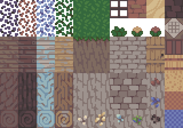
Somehow managed to do the wools with the palette too, pink cyan and a couple of others are a bit... Iffy... though.
-
View User Profile
-
View Posts
-
Send Message
Curse PremiumQuestion, are models allowed? I've already made a few for my pack and IMO they fit with the simple theme.
I would vote on yes, as long as they are simple in theme. Not too many cubes.
Anyways, small update now that I've finished exams:
-snip-
Somehow managed to do the wools with the palette too, pink cyan and a couple of others are a bit... Iffy... though.
Looking really nice, though I would suggest if you continue the pack after the contest is over that you tweak the wool colors a bit.
-
View User Profile
-
View Posts
-
Send Message
Curse PremiumYea, I'd be adding a few colours so I can get the full selection of colours needed for wools, clays and tinted glass. Apart from that I'm going to try and stick with the palette once the contest is over.
Gosh! These are so awesome! Your ores could benefit from some more pop. Lovely shapes, though. Your crafting table, door and woods are brilliant. And I am totally jealous of your neutral stone colors. Much easier to work with, I expect.
These are what I got, folks.
Note a few new blocks above: tilled soil, bookshelf, diamond block [shading added], stone brick. I slightly simplified the shadows under my diamond ore tile and changed the red brick and sand to fit stylistically.
Also: Call me Matt. No need to type out my username.
-
View User Profile
-
View Posts
-
Send Message
Retired StaffEek! A real name! It burrrnssss. *hiss*
nice textures though. It looks like you're doing fine with the stone. Diamond block could use more shading though.
@sheep: excellent as always
-
View User Profile
-
View Posts
-
Send Message
Retired StaffNew tallgrass, pumpkin/jackolantern, sand, and oak log.
Here's a screenshot of the tallgrass in game:
I haven't really gotten much feedback on my textures so far.
What do you think about them so far?
Other textures: http://imgur.com/a/mADAc
I finished the ores and ore blocks:
Though I might hesitate at calling these blocks simple, they are absolutely stunning, Fishy! Also, a little more detail on that diamond block. Otherwise, these are as perfect as possible.
-
View User Profile
-
View Posts
-
Send Message
Curse PremiumIn other news, I am trying to review which packs I consider inspiring to the textures I am making currently. These three, I determined, are most instrumental:
If you are interested in some thoughts on these creations:
Dandelion is the work I like to use most when actually playing Minecraft. The reason for this is the colors. They are warm and blend smoothly. I am, after all, using Steelfeathers' palette for the challenge.
Ovo's Rustic, somehow, provided a realistic gaming experience at a resolution that did not make your eyes bleed. Grass appeared tangible in game. Cobblestone looked rough and planks looked rustic. Altogether, Ovo created something which set a mood. I want to do just that with this pack.
This all being said, take a look:
Some recommendations I have already: (1) continue to differentiate wood textures while keeping the colors nice; (2) simplify the ores; (3) get started on furnace and doors afterwards.
Now, what do you have to say? Sincerely, Matt.
Edit: Fixed tiling of sand
-
View User Profile
-
View Posts
-
Send Message
Curse Premium@iiPod I share the same view of your work as many others do; it is marvellous. Well done.
I do think, however, that the tall grass is a bit too bevelled. It sort of looks like an alien plant.
-
View User Profile
-
View Posts
-
Send Message
Curse PremiumI wanna see how iipods textures look in game, it looks so juicy in that picture but I feel like the highlights on the stone and the big gaps between leaves might detract from the look a bit just due to how some things look in game (large expanses of stone which could make the layered look seem odd, the shadow that's automatically added behind leaf blocks, etc.)
Still, they look really nice in that pic and it's a neat style for sure!
Also fwiw I think your textures are nice, Matt. I do see the similarities between our cobble, stone bricks and bricks but to be frank, I really don't mind. I'd rather see more new textures from you than you redoing old textures just because they share similarities with mine.
I also like your current stone and the purple netherbrick but how well it works will depend on how the rest of the nether looks. As for crits, I guess you could smooth the sand form out a little, remove the gradient towards the top of the wheat (it doesn't contribute in any way imo, just adds colours and reduces the simplicity) and you could vary the colours of your logs a bit more, having them all the same colour is confusing from a game play perspective but also puts a cap on possible creativity that using interesting colours provides.
Anywho, I'll post some more progress shortly, got more stuff done and a couple more models to go with them.
-
View User Profile
-
View Posts
-
Send Message
Curse PremiumSome textures? The ores, gravel and basically EVERYTHING are pretty boring, but I'm really tired to-day and cannot be bothered doing more work.
EDIT: I've fixed the unequal dirt and grass lines.
-
View User Profile
-
View Posts
-
Send Message
Curse PremiumMy progress thus far:
My main question is: does everything seem "simple" enough?
Also... I cheated on those spruce leaves... they're just a default recolor. That is until I muster the strength to take on the challenge of making good spruce leaves. Like grass, but with an alpha channel... yaaaaaaaayyy.
Edit: Patch, why are you still wearing a santa hat?
I appreciate the advice, Sheep. And additional thanks for your tolerance about the texture similarities.
Below are some improvements made to the bulk terrain file above, which has also been edited. I am very satisfied with the birch block. After many trials - all errors - I think I succeeded. Very much inspired by the actual trees' looks. Great tip, Malcolm5211! Now I need to make sure the rest of the pack fits around it!
-
View User Profile
-
View Posts
-
Send Message
Curse PremiumFigured I`d get some in game screens since school`s over. Forgot to remove the biome tint but whatever...
-
View User Profile
-
View Posts
-
Send Message
Curse PremiumLeaves and some more dirt types.
I need inspiration for ores. Any ideas?
This is what I have so far.
I'm having trouble with the redstone colors.